
A strong visual brand makes a small business easier to recognize, trust, and remember. It is not just about having a nice logo or a pretty Instagram feed. It is about creating a clear look that tells people who you are before they read a single sentence.
For small businesses, that matters because every touchpoint counts. Your website, packaging, social posts, emails, signs, invoices, and ads should all feel like they belong to the same business.
Start With What Your Brand Should Feel Like
Before choosing colors or fonts, get clear on the feeling your brand should create. Are you warm and local, clean and premium, bold and energetic, or calm and expert? That emotional direction will guide every visual choice later.
This step also keeps you from copying competitors just because their branding looks polished. A bakery, a personal trainer, and a bookkeeping service all need different visual energy.
A simple starting checklist helps:
- Define your main audience
- Choose three brand personality words
- Note what customers should remember
- List visuals that do not fit your brand
Once you know the feeling, design becomes less random. You are not just choosing what looks good. You are choosing what feels right for the people you want to reach.
Build A Logo That Works In Real Life
Your logo does not need to explain everything your business does. In fact, the best small business logos are usually simple enough to work on a website header, product label, business card, social profile, and invoice without losing clarity.
If you are just starting and do not have the budget for full custom branding, tools can help you test directions quickly. You can try this text logo maker to explore wordmark ideas, spacing, font styles, and simple logo layouts before deciding what feels right.
A practical logo should pass a few basic tests:
- It stays readable at small sizes
- It works in one color
- It does not rely on tiny details
- It feels aligned with your business tone
- It can grow with the brand
Think of your logo as a signature, not the whole story. The full visual brand comes from how everything works together.
Choose Colors With More Strategy And Less Guesswork

Color is often where small businesses get stuck because there are endless options. The trick is to build a small color system instead of picking random shades every time you design something.
You usually need one main color, one or two supporting colors, and a few neutral tones for backgrounds, text, and borders. This keeps your brand flexible without making it messy.
| Brand color role | What it does | Where to use it |
| Main color | Creates recognition | Logo, buttons, key graphics |
| Accent color | Adds energy | Promotions, highlights, icons |
| Neutral color | Keeps things readable | Backgrounds, text, layouts |
Also check contrast. WCAG guidance explains that normal text should generally meet a 4.5:1 contrast ratio for better readability. Pretty colors are useful only if people can actually read them.
Use Fonts That Match Your Brand Voice
Fonts quietly shape how people judge your business. A playful rounded font feels different from a sharp modern one. A traditional serif font says something different from a clean sans serif. None of these choices are automatically right or wrong. They just need to match your brand personality.
For most small businesses, two fonts are enough. Use one for headings and one for body text. If you want a very clean look, use one font family with different weights.
Keep these rules simple:
- Avoid using more than two font families
- Make body text easy to read
- Use bold styles for emphasis only
- Keep heading sizes consistent
The goal is not to show off typography knowledge. The goal is to help people read, trust, and recognize your brand without friction.
Create A Consistent Image Style

Images can make or break a visual brand. If one post uses bright studio photos, another uses dark moody filters, and another uses random stock photos, the brand starts to feel scattered. Customers may not notice the exact issue, but they feel the inconsistency.
Choose a clear image direction. Maybe your photos are bright, natural, and people-focused. Maybe they are product close-ups on clean backgrounds. Maybe they use warm lifestyle scenes.
A useful image guide can include:
- Preferred lighting style
- Background choices
- Photo angles
- Editing style
- Types of images to avoid
Small businesses do not need a professional shoot every week. You just need repeatable rules. Even phone photos look more polished when the lighting, background, crop, and editing style stay consistent.
Make Your Website And Social Media Feel Connected
A better visual brand should travel across platforms. Your website should not feel like one business while your Instagram, Facebook, LinkedIn, or TikTok feels like another. People often check several places before buying, booking, or sending a message.
Use the same profile photo or logo version everywhere. Keep your colors, fonts, cover images, post templates, and highlight graphics aligned. This makes your business look more established, even if the team is small.
Important note: consistency does not mean every post must look identical. It means the same visual rules are working behind the scenes.
You can still vary layouts, photos, and messages. Just keep the recognizable parts steady so people immediately know the content belongs to you.
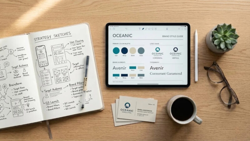
Build A Small Brand Kit You Can Actually Use
A brand kit is not only for big companies. Small businesses need one even more because it saves time and prevents messy design decisions. It also helps when different people create content for the same business.
Your brand kit can be simple. Start with one document or folder that includes your logo files, colors, fonts, image rules, and a few ready-made templates.
Include these basics:
- Logo versions
- Color codes
- Font names
- Social media templates
- Image style notes
- Basic do and do not examples
This gives your business a visual foundation. When you need a flyer, ad, menu, presentation, or product label, you are not starting from zero. You are building from a system that already feels like your brand.
Review Your Brand Like A Customer Would

Once your visual brand is in place, step back and look at it from a customer’s point of view. Open your website, social profiles, emails, product pages, and printed materials. Do they feel connected? Can someone understand what you offer quickly? Does the brand look trustworthy?
Small improvements often make a big difference. Maybe your logo needs more breathing room
Maybe your buttons are hard to see. Maybe your photos look too inconsistent. Maybe your colors look good on desktop but weak on mobile.
Ask yourself:
- Is the brand easy to recognize?
- Is the text readable?
- Do visuals match the price point?
- Does everything feel current?
A visual brand is never truly finished. It should stay consistent, but it can improve as your business grows.
Frequently Asked Questions
1. How often should a small business refresh its visual brand?
A small business should review its visual brand at least once a year. That does not mean changing the logo every year. It means checking whether your visuals still match your audience, offers, pricing, and market position.
2. Should a small business use templates for branding?
Yes, templates are useful when they follow your brand rules. They save time and keep content consistent. The mistake is using unrelated templates that all look different, because that weakens recognition.
3. What is the biggest visual branding mistake small businesses make?
The biggest mistake is inconsistency. A strong brand can be simple, but it should not look different every time customers see it. Repeated colors, fonts, images, and layouts build familiarity over time.
Final Thoughts
A better visual brand does not require a huge budget. It requires clear choices, repeated consistently.
Start with the feeling you want to create, then build a logo, colors, fonts, images, and templates that support that feeling.
When everything works together, your business looks more professional, more memorable, and easier to trust.